Today was mostly about the boxes. We placed them together on a table and then engaged in a group communication about them. What were the obvious differences in the boxes, interior vs exterior, open vs closed, types of containers used, etc. Following this we proceeded to communicate to the class on an individual basis, taking turns presenting our box to the rest of the class and telling a little about it. This would be a good follow up to the exercise in a high school class, but time might become an issue in a larger class. To get around this issue one might ask the students to stand up and tell the class 3 things about their box.
Following the P/R for the boxes we were introduced and began working on the next assignment; masks. I have done these kinds of masks before and really did not enjoy the feeling of the shrinking/drying plaster covering my face. As a result myself, as well as a couple other students, built head shaped forms from news paper and constructed our plaster forms on top of those. I decided to keep mine fairly featureless in construction and will end up creating the features with paint or other materials. My thoughts on the design, at the moment, are to create a slightly disfigured older being. beyond that I have a couple of ideas and have begun sketching some of them out.
at the moment I am leaning more towards the one on the right, an aged ninja-turtle type creature.
Wednesday, January 26, 2011
Enduring thoughts
I started thinking about enduring ideas. I started by looking at the words themselves. what are the meanings of "enduring" and "idea". I looked at dictionary definitions, the roots and origins of the word, and found a quote I enjoy about ideas.
From here I decided to do a mind map of some of the qualities of "enduring" and see where that lead me.
I quickly realized that the page I was working on was going to end up being far too small so I started over and expanded my central thought from "enduring" to the whole concept "enduring ideas"
There are several things that came out of this exercise that I am going to investigate further in fleshing out a single idea for the project: the idea of archetypes as cross cultural enduring "forms" is incredibly appealing to me. The other one is "courage" or "bravery". I'd like to see where that one could end up going.
Sunday, January 23, 2011
the Life Box
The box: to be constructed from the above book. I decided to build a "box" from a book because the largest part of my life at this time is being a student.
and so with a lot of glue and a lot of time waiting for things to dry, the pages were all glued together and the center cut out
I contemplated just filling the box up with some things that reflect the "inner me" but instead decided to take it in a slightly different direction. I did some sketches and came up with some visual metaphors to represent the things I hold closes to me and transferred them onto acetate.
and then painted them all in
at this point the walls of the box were divided into sections to keep the painted pages separate, creating some depth in the scene.
all that was left was to do the outside of the box. I took some of the pages that came from the book and tore them up and pasted them onto the outside to cover all surface. I also added some images torn form a Where's Waldo book as well as some photographs and drawings.
This life box exercise was interesting for me. Exploration of self is something that I have explored before in the studio, and I always find it to be a revealing experience. However, because this followed the mandala assignment so closely, I did not have any trouble of have to invest much thought into what I was going to do for as far as visuals go. The one thing I felt through the creation of this piece was frustration - with the time investment in gluing all the pages of the book together, with the knives I was using dulling quickly and ripping pages, with the glue not adhering to the outer surface of the book, all technical things.
Friday, January 21, 2011
Jan 19th Class Recap
The next project: Engage Art (enduring ideas)
Enduring ideas are ideas that are timeless and universal. Some examples are: honesty, trust, freedom, courage, communication and moods or expression.
One enduring idea I would like to further investigate for this project is Courage and/or Perseverance.
The assignment is to take an enduring idea and on of 3 given devices and create a piece. I believe it can be any medium, size, etc, so long as it clearly conveys the idea chosen and utilizes one of the following devices:
1. Juxtaposition
2. Transformation
3. Distortion
In Class Discussion:
We discussed the elements of art in relation to real life. ie. what is a life of value? what is a life that is full of colour / empty of colour? What kind of a line could represent your life? etc. This could be done with a class in conjunction with teaching the elements and principles to help students relate the application of the E's and P's in art to things they know and understand. It might also be helpful to put it into practice by following the discussion with a "drawing to music" exercise. Doing this exercise in a circular format would be a good lead-in to mandala's as well.
here are some examples of pieces from a "drawing to music" exercise I did with a small group last year.
more examples from the exercise can be found (here)
![]() | |
| Katrina Baker |
![]() |
| Justin Robinson |
Spiral Staircase
The final Mandala:
I ended up using aspects of the drawing I did in class (last post) but my process took me much further and I developed this image instead. In class we put them up and told the class briefly about the image. From there we were asked to give one positive comment and one comment or suggestion pertaining to improvement on one or two of the others mandalas.
the feedback I received:
- I like the circles, they look like bubbles!
- I really like the gradient of light to dark from top to bottom as well as the square connecting to the large circle. It is extremely well balanced and the choice of medium and colour is perfect. It almost feels like a picture taken from underwater. Well done!
- The colours of this piece are magnificent. Very symmetrical! This piece GLOWS!
- Beautiful/ A more matte finish might have helped to reduce glare though :)
- I love the scale of it. Because of its size, it is extremely eye catching and makes it difficult to look at any other: it really takes the spot light. I think it was a great choice to use the gloss paper - it adds another element to it that makes the piece so eye grabbing.
- I like the transparency of the geometric shapes over each other. I also like the light on the top. Maybe try to use more colours.
The comment about adding more colour was of particular interest to me because I had two finished versions of this piece. the other one included a very slight difference in design, and had more colour.
The reason I did not end up using this one was because when I went to the printers, their magenta's were printing off and needed to be re-calibrated. Over all I am extremely pleased with the way that the piece turned out. If I were to change anything with either of them, it would to be to add the spiral in on the second one and remove the left eye socket. On the first one I might add some fuchsia or magenta in as a glow under the square that contains the mouth portion.
Sunday, January 16, 2011
Mandala and other such things
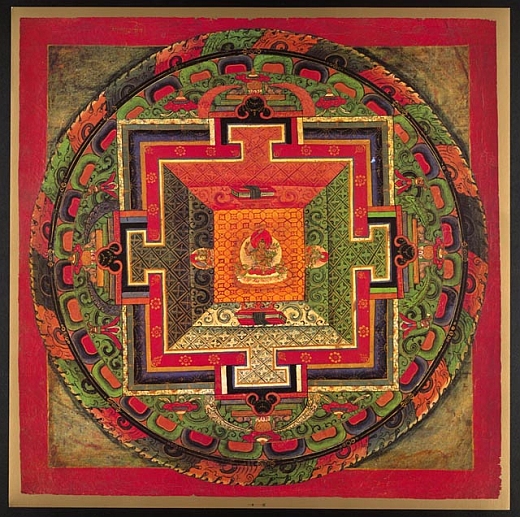
In class we discussed what mandala are. Some characteristics that they often have in common are: circular in shape, often surrounded by a square, associated with unity, oneness, and spirituality. Some examples are the Medicine Wheel and Tibetan temple blueprints.
Zen art is similar to mandala in that it is associated with oneness, harmony, order, etc, as well as being commonly represented with the circle. Zen circles are a single stroke created with a brush and ink after meditation or practicing mindfulness.
Following this discussion we were shown a video of Alex Grey, an artist that uses art in a healing and spiritual way. He stated in the video that he works on the principle that if there is art that can induce depression or feelings of sorrow, there must also be art that has the opposite effect.
Assignment:
we began working with shapes and a basic understanding of mandala in class and were given tools to draw mandala. I worked exclusively with circles and eventually ended up with a fractal image ~
I may or may not continue to work on this further, or start over for the final design. I also experimented with interconnected knots.
I enjoy the aesthetic of this and will likely incorporate it into my design.
![]() |
| Tibetan mandala is a temple design |
![]() | |
| the Medicine Wheel and dream-catchers are both mandala |
![]() |
| a zen circle |
![]() |
| kissing |
Assignment:
we began working with shapes and a basic understanding of mandala in class and were given tools to draw mandala. I worked exclusively with circles and eventually ended up with a fractal image ~
I may or may not continue to work on this further, or start over for the final design. I also experimented with interconnected knots.
I enjoy the aesthetic of this and will likely incorporate it into my design.
Monday, January 10, 2011
The Right to Education
Posterfortomorrow.org just released their issue for 2011. With last years Human Rights Violation and Capitol Punishment exhibition showing around the world, They have set Dec 10th, 2011 as the date to premier their "the Right to Education" show in the first annual poster for tomorrow day. Entries open March 10, close July 10.
Subscribe to:
Posts (Atom)